For shoppers, TryNow is a simple button at checkout on their favorite brand’s retail sites. Behind the scenes, it’s a complex Rube Goldberg machine of payments, shipping, and inventory management.
Art director: Kate Carter
Copywriter: Nick Carter
Animator: Kayla Winter
TryNow
Creative directionContent strategyDesign workshopsProduct design Creative principlesWeb designArt direction & design
We aimed to create a new brand that captures that revolutionary simplifying of the complex, and the amazing promise of being able to freely try and find new things to love.
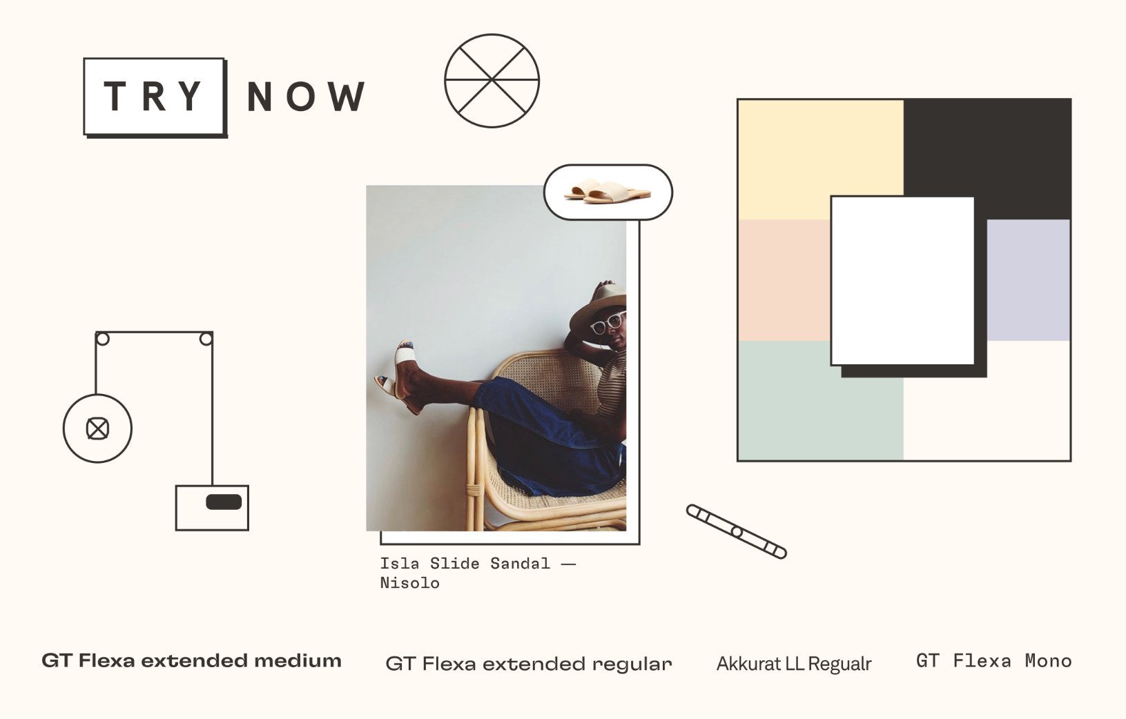
By making the logo both a button and a call to action, we invite people into the brand promise every time it appears. The color palette creates warmth from dusty, muted hues that allow photography and illustration to take center stage.
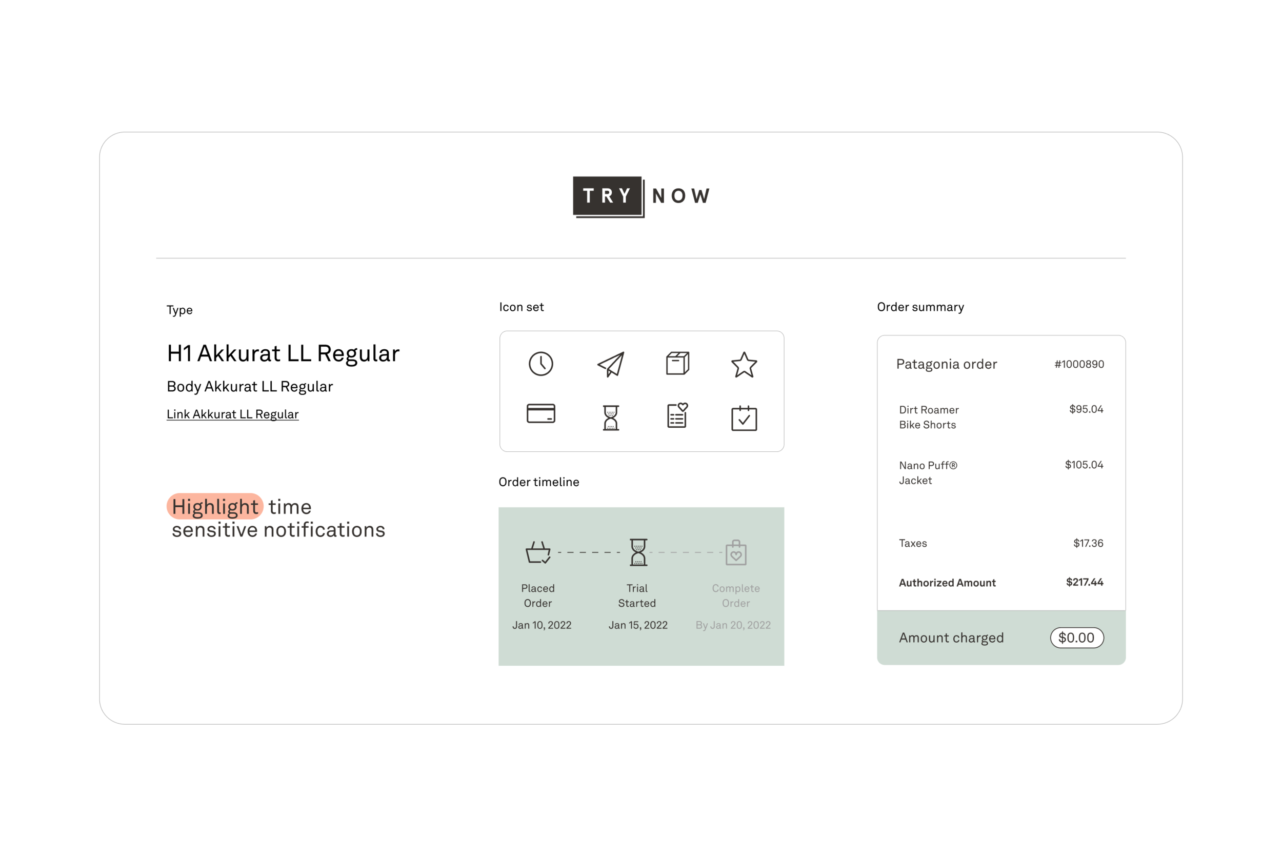
Within the product we simplified the brand. Still using line work but instead of complex shapes, as rules and icons. We brought out the sage green as the primary product color along with charcoal and white.
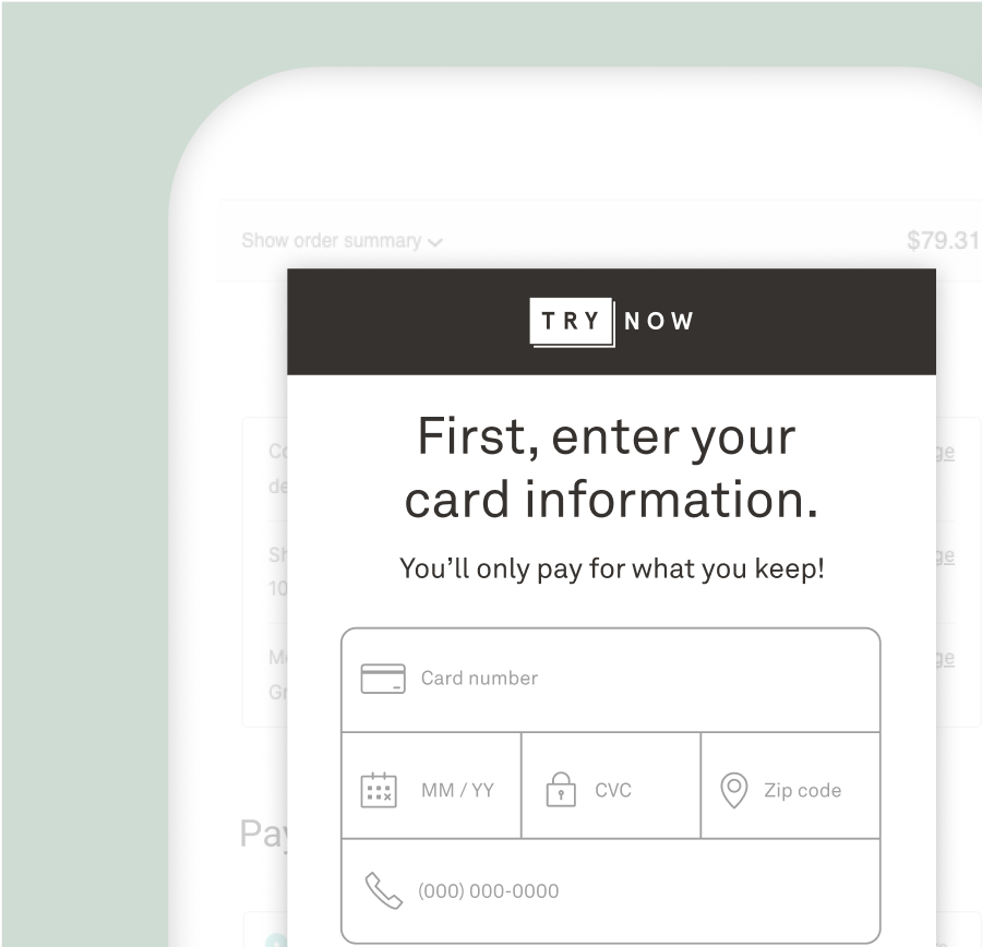
Checkout screens

Email updates

In the TryNow portal